TOKI×Table
Free weekly stream schedule image maker — design in the browser, export as a PNG
Design your weekly stream schedule in the browser and export it as an announcement image (PNG). Table and card layouts, 24 presets, side-by-side time zones and free placement for character art and shapes — the exported image is ready to post as it is. The start date follows the current week every time you open the tool, so a weekly update is just swapping the contents. No account, no external server, settings persist in the browser's localStorage. Sharable via JSON.
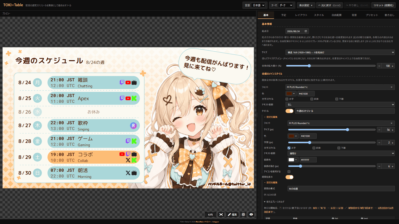
Concept
Announcing a weekly stream schedule means rebuilding the same layout every week: open the template in an image editor, retype the dates, shift the weekdays, swap the contents. TOKI×Table exists to kill that loop.
The start date follows the week containing today every time you open the tool (it keeps the weekday you saved and carries the contents of each day over). There is no “next week” button to press — open it, rewrite the contents, export.
The other pillar is showing several time zones side by side. Overseas viewers can read 21:00 JST / 12:00 UTC at a glance, and because each row is converted on its own real date, daylight saving transitions come out right.
The output is a still image (PNG) you can post as it is. It is the sibling tool of TOKI×Maker and, like Peraravatar, runs entirely client-side with no external server.
Features
- Layouts: Table (weekdays stacked as a list) / Card (weekdays laid out as a grid of cards)
- Schedule table: hide it and the layout can be built from free-placed elements alone
- 24 presets: 10 table / 12 card / 2 other (see Presets)
- Size: Landscape 16:9 (1920×1080) / Landscape 16:9 (1200×675) / Portrait 4:5 (1080×1350) / Square 1:1 (1080×1080) / Phone portrait 9:16 (1080×1920) / Custom
- Time zones side by side: Inline / Two lines / Footer note only. The primary zone is searchable by IANA name, and up to 2 additional zones can be shown
- Start date: updated to the week containing today each time you open the tool (the saved weekday and the contents of each day are kept)
- Multiple slots per day: start / end time, content, platform, guests, fill color and border color per slot
- Platforms: Twitch / YouTube / X / ニコ生 / Kick / REALITY / Custom (your own icon and name). Shown as Icon + name, Icon only or Name only
- Content is rich text: change the font, color, size, bold, italic and underline of the selected range, and insert line breaks. Translation (2nd line, optional) and Ruby (above label) are supported
- Free placement: text / image / icon / shape positioned by X / Y (px), rotation, flip and opacity
- Clipping: frame character art as a circle / square / rounded / star / heart / diamond / hexagon / triangle / custom icon. Choose Single or Multiple clips
- Shapes: circle / ellipse / rectangle / rounded / speech bubble / triangle / diamond / star / hexagon, with a bubble tail that slides along the edge
- Background: solid / linear gradient / radial gradient / image, plus 37 patterns with multi-color fills and opacity
- 100+ fonts: Japanese / Korean / Chinese / Thai / Russian / monospace / sans / display / script
- Text styling: bold / italic / underline / neon glow / outline / blur shadow / retro shadow
- Layers: the five blocks (schedule table, title, period, footer note, icon + handle) and every free-placed element live in one ordered list you can reorder and group
- Edit mode: drag, resize from the corners, rotate and pan crops right on the preview. Clicking an element jumps to its settings
- Export: PNG image / clipboard copy / social share / JSON
- Autosave: always stored in localStorage, with Undo / Redo (
Ctrl+Z/Ctrl+Y) - Languages: Japanese / English
- UI options: theme (Dark / Light / Fancy / Handcraft), menu side (right / left), text size (90–150%), hide UI
- Mobile: stacked layout on phones (preview on top, menu below)
Layouts
The first control in the Layout tab switches between Table and Card. Your schedule contents are kept, but each layout needs its own adjustments after switching.
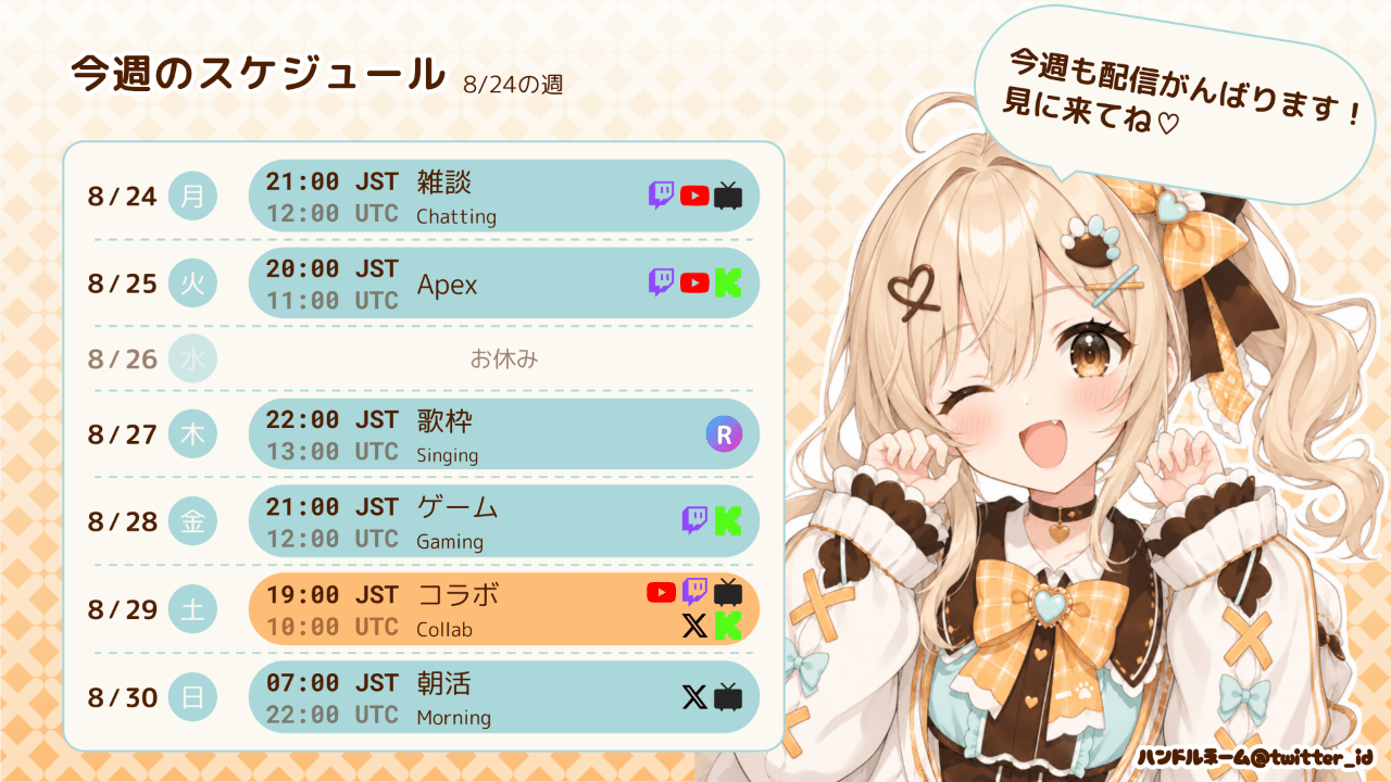
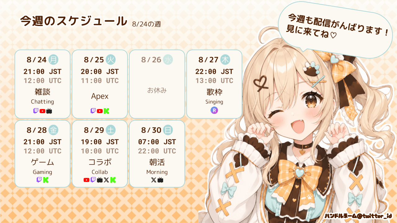
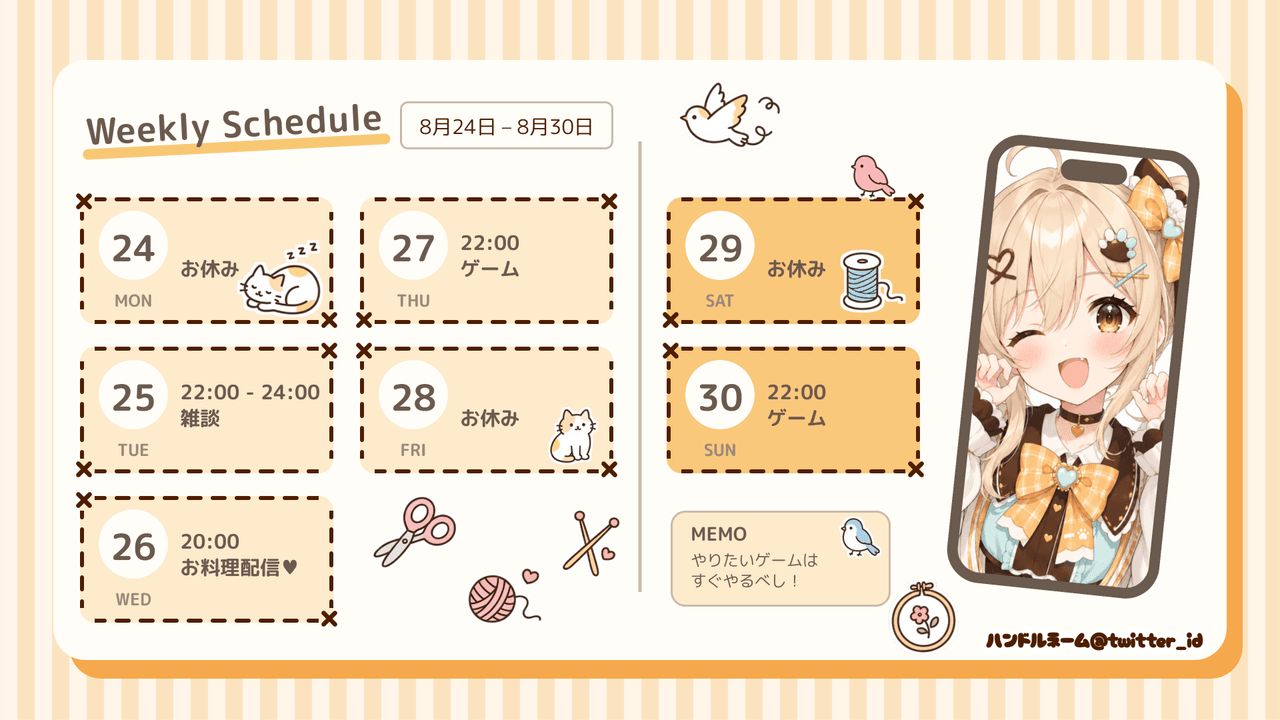
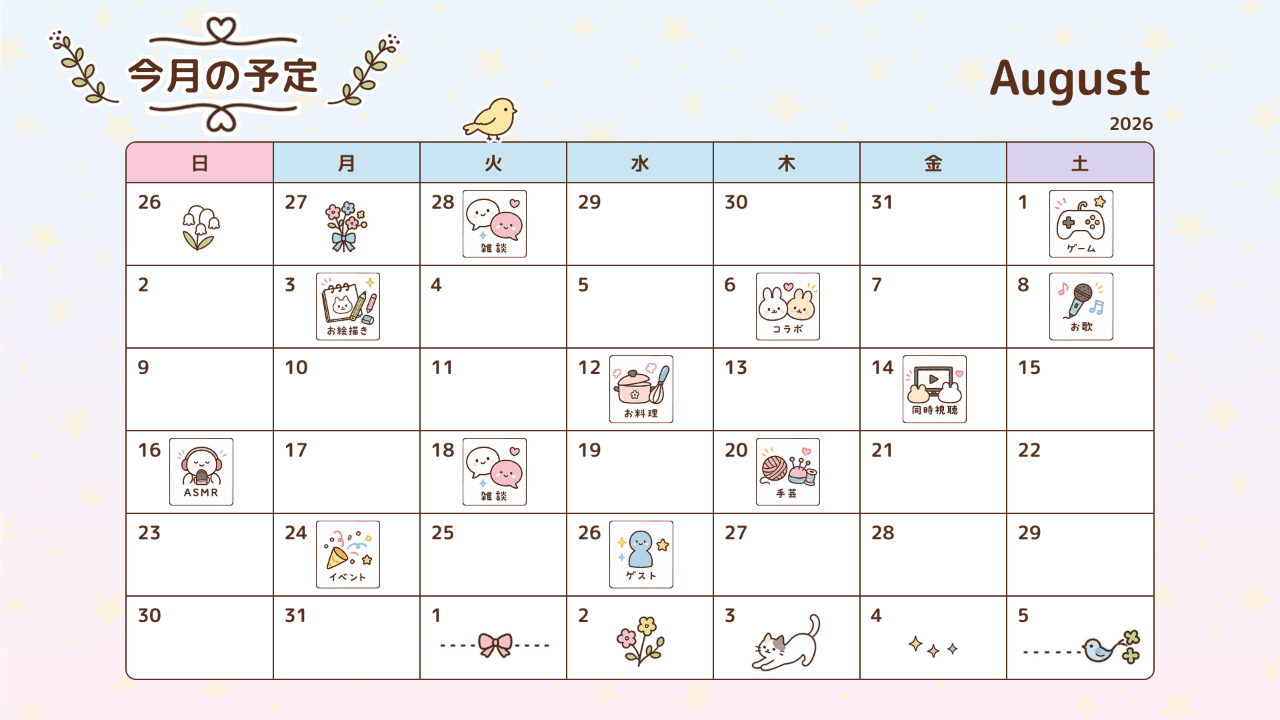
Table
Weekdays stacked vertically. Date / weekday, time, content and platform line up as columns whose widths are either auto-matched or fixed in px. Column headers and a leading checkbox are available.
Card
Each weekday becomes a card on a grid. Set the number of columns, the card shape (8 options: rectangle, rounded, circle, half-circle, image and more), a date band and a thumbnail image.
No table
Hide the schedule table and the layout can be built from free-placed elements alone.
Presets
Apply a preset with one click from the Preset tab, then fine-tune it in the other tabs — that is the fastest workflow. Tick “Keep schedule content (text / time / date)” to swap only the look while keeping the schedule you already typed (per-character colors and sizes are not carried over — the preset’s base style is applied).
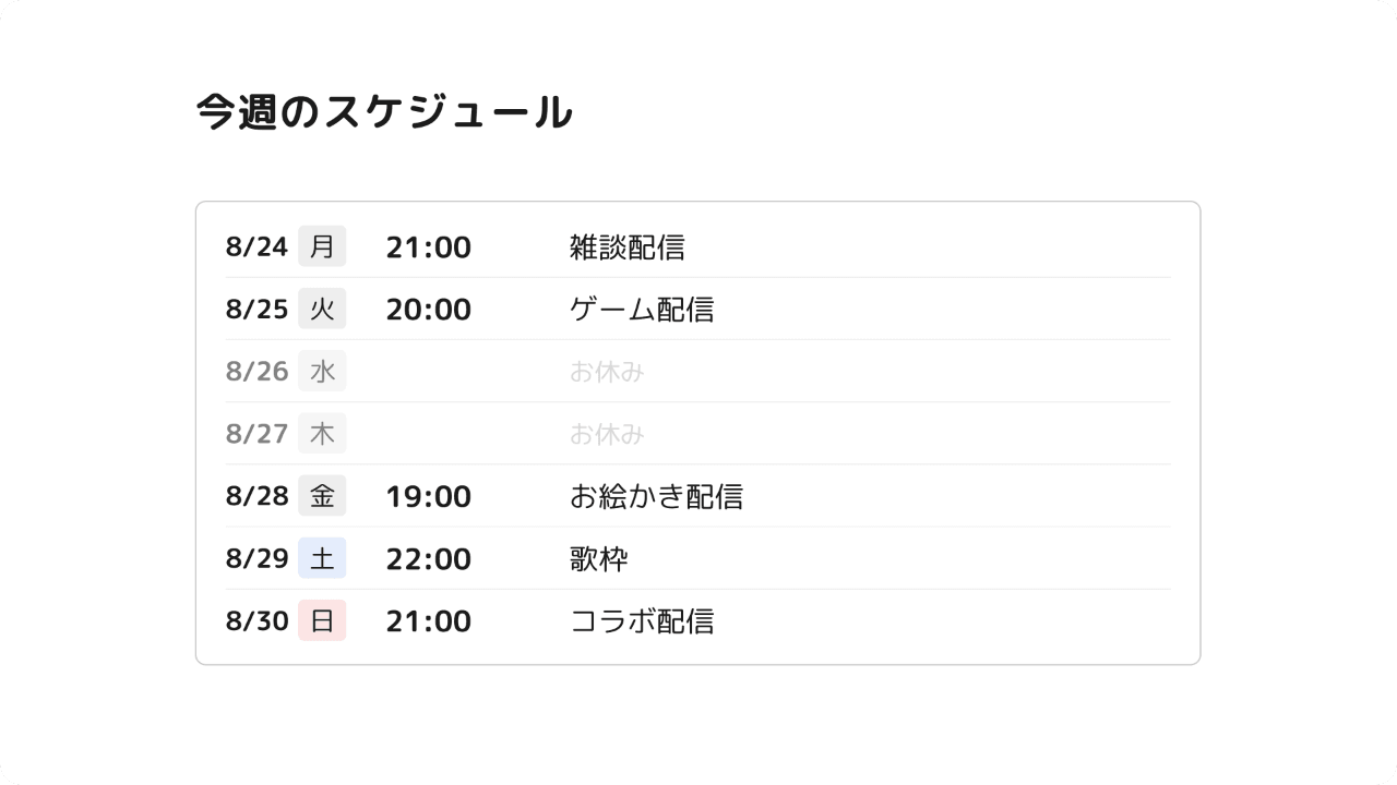
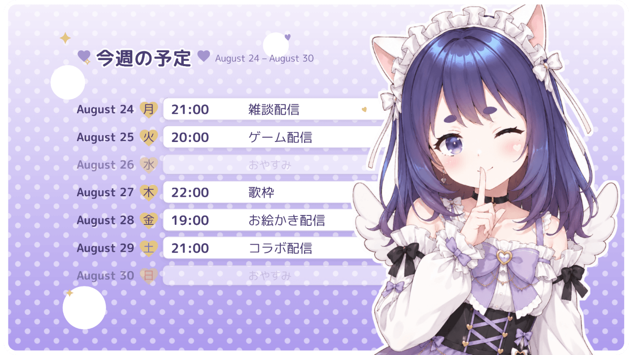
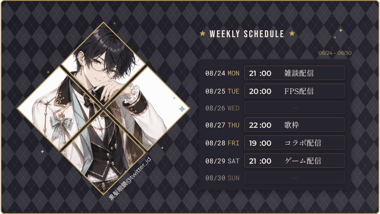
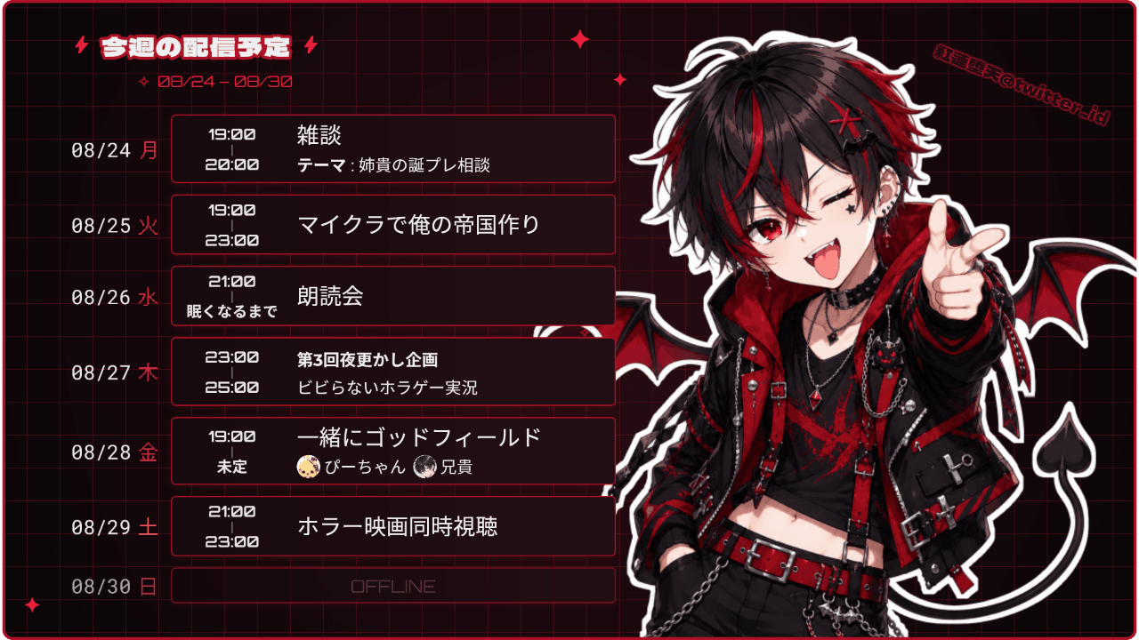
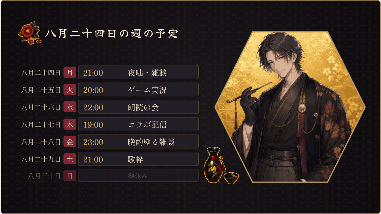
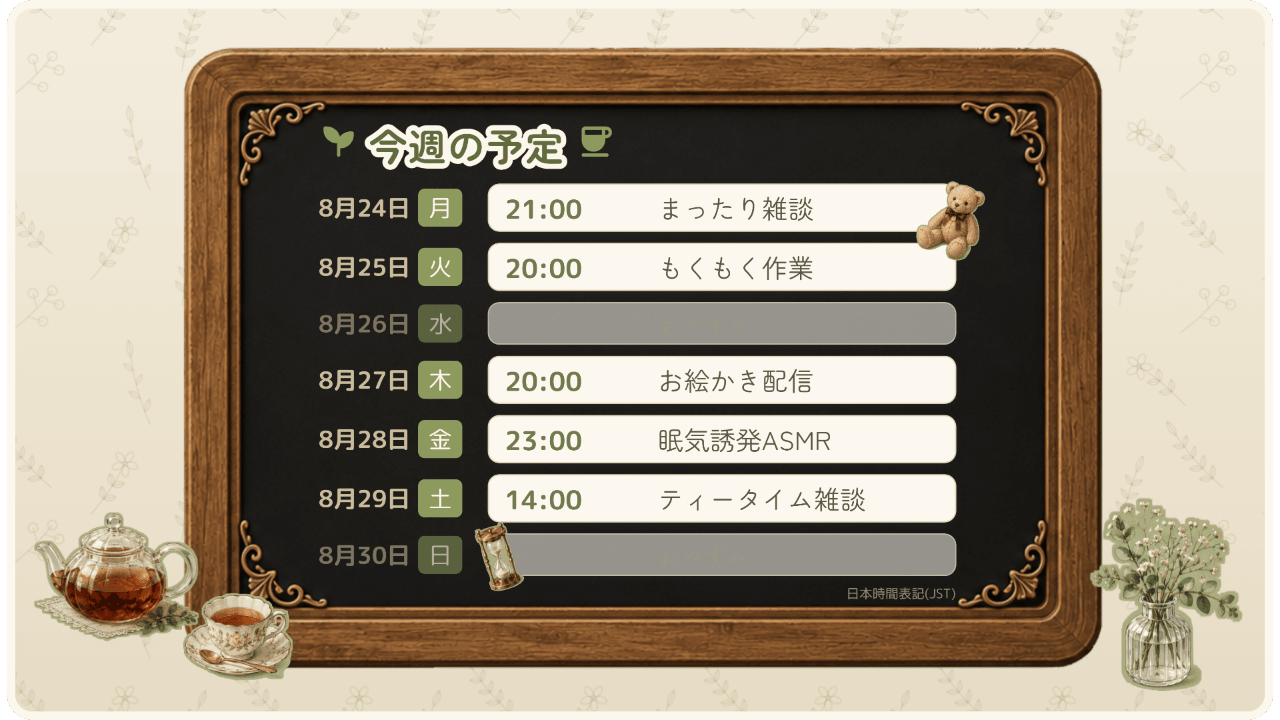
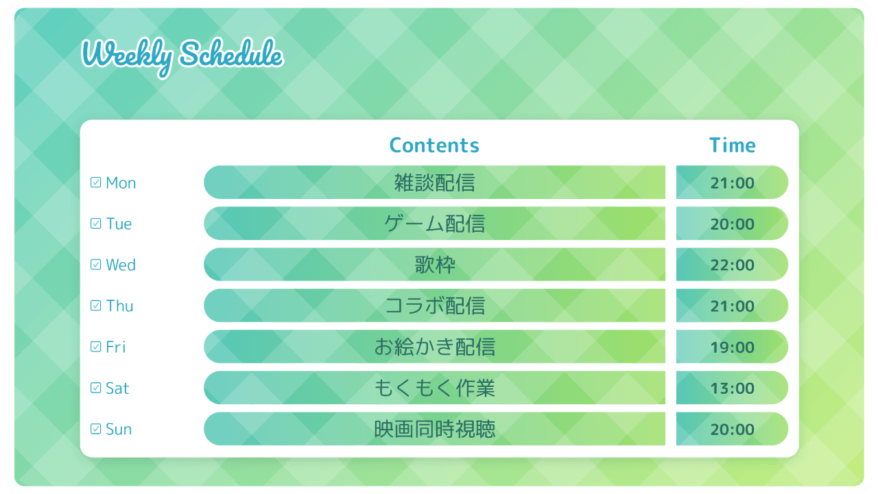
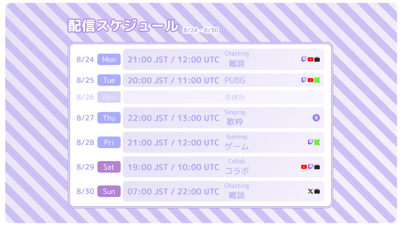
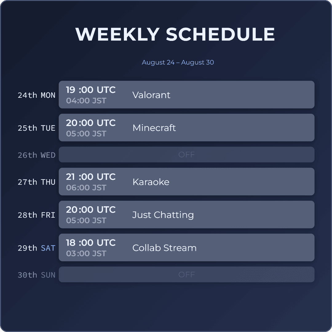
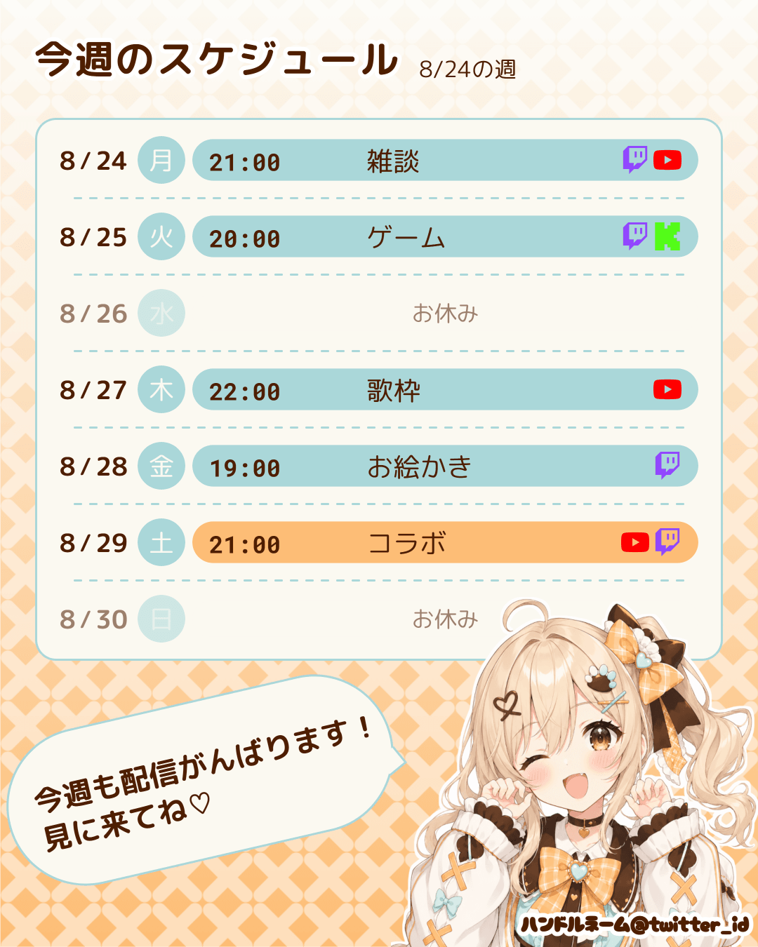
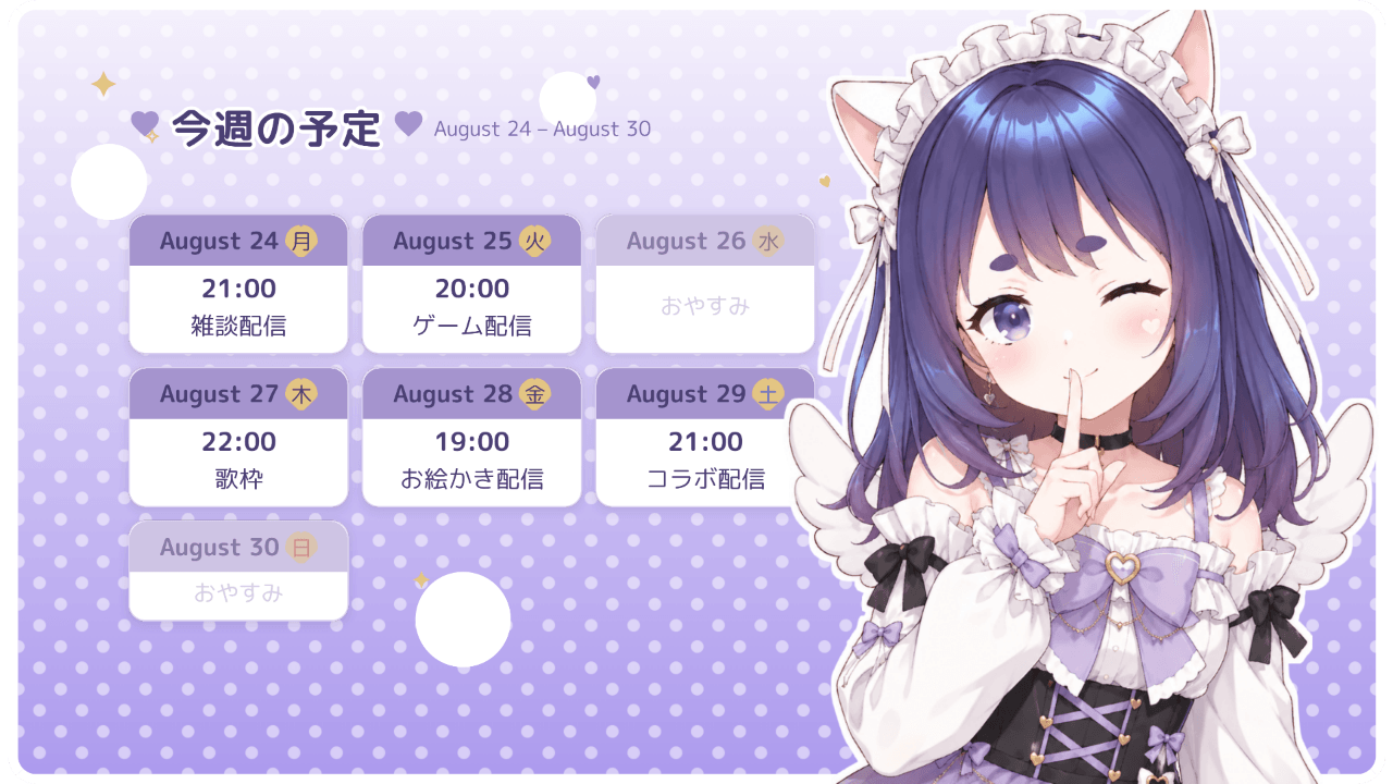
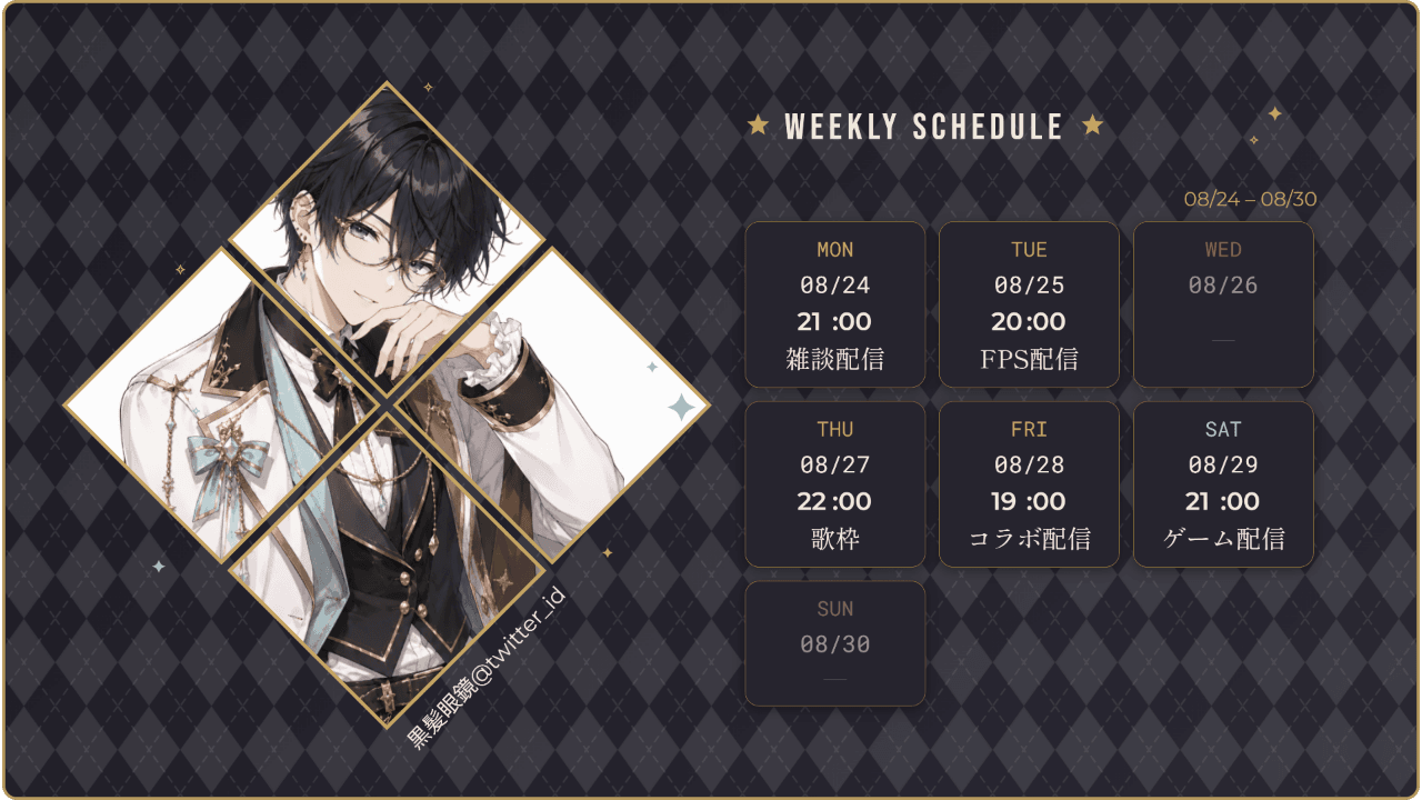
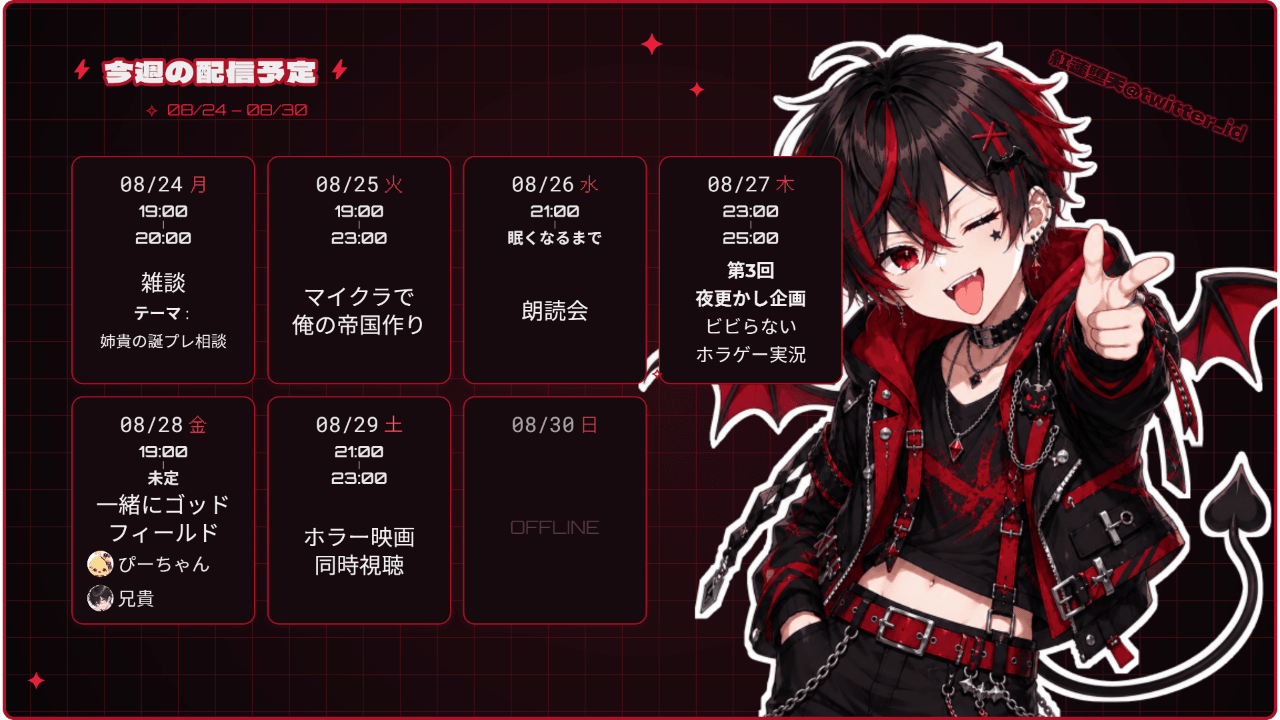
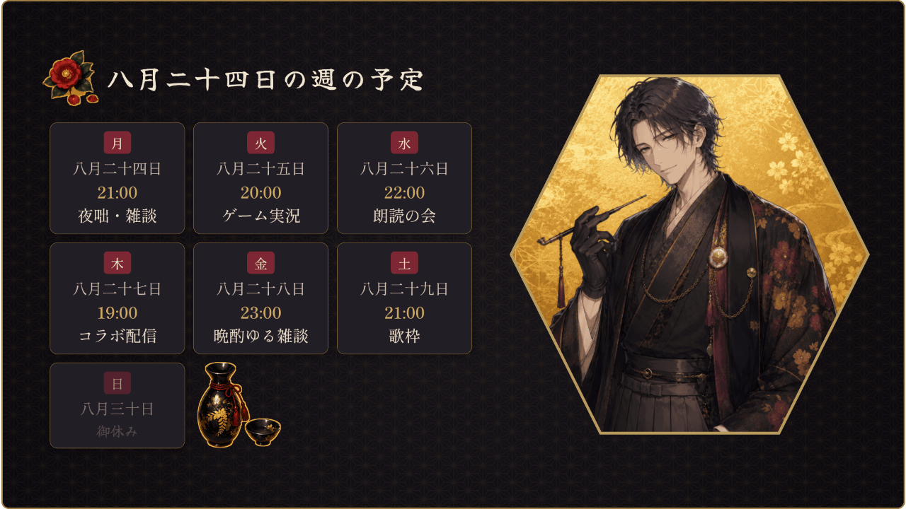
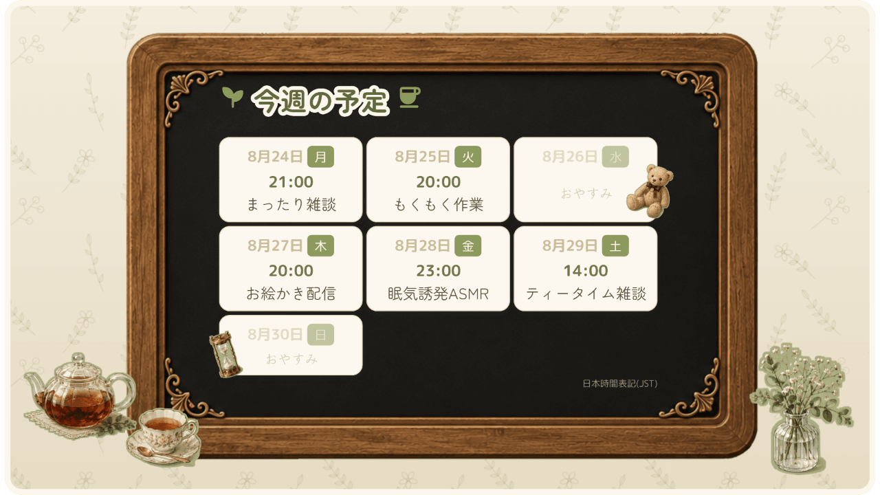
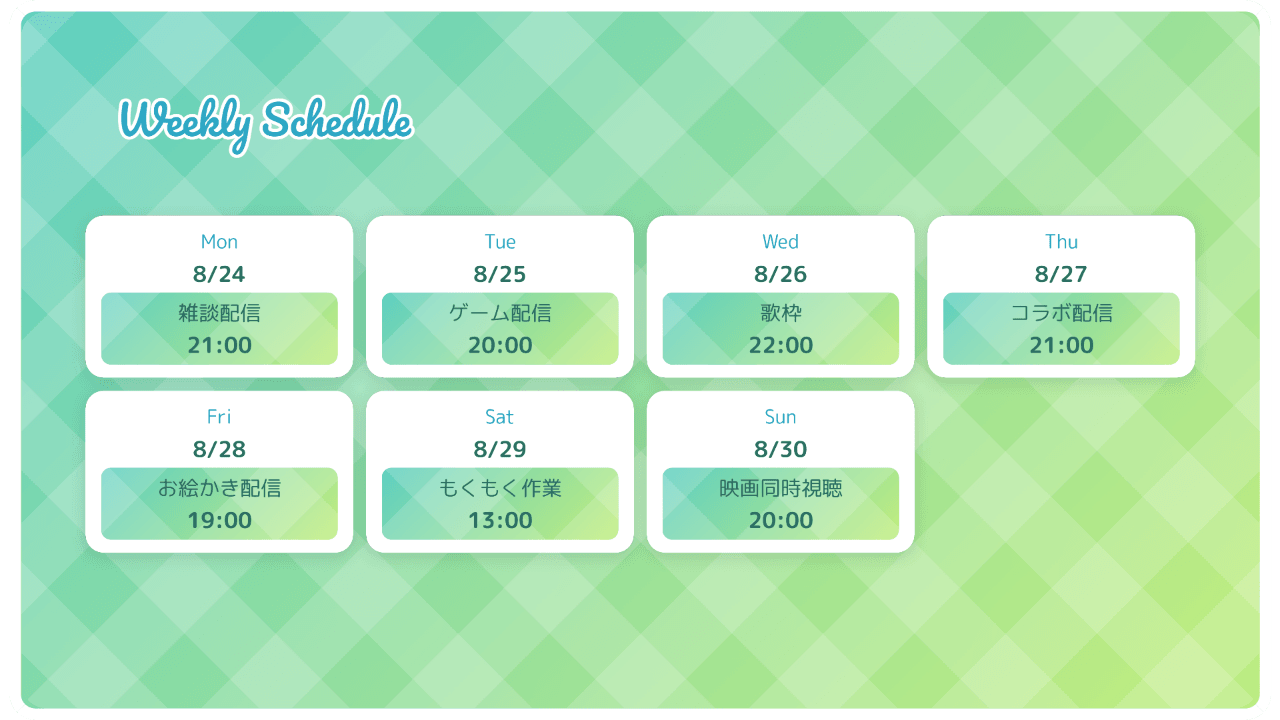
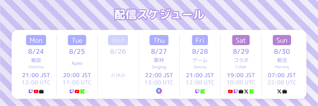
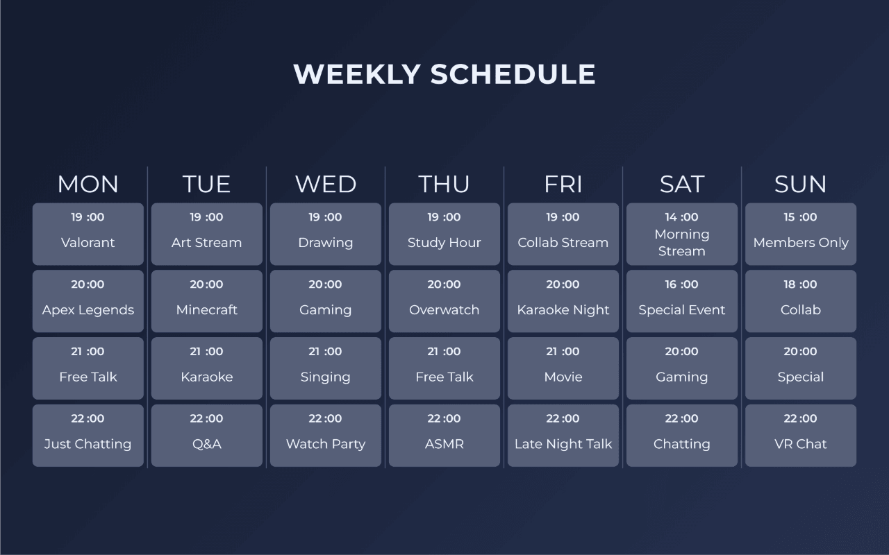
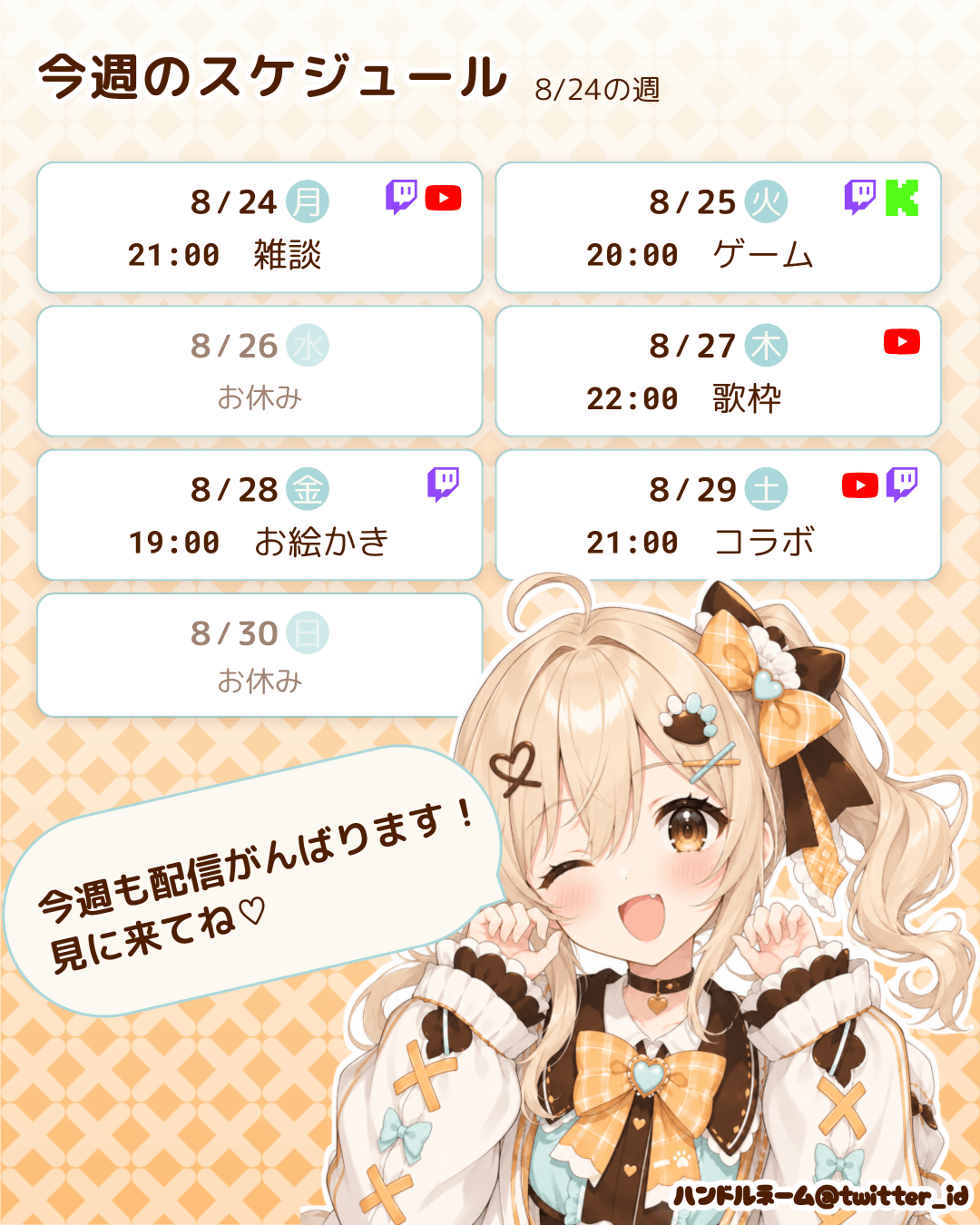
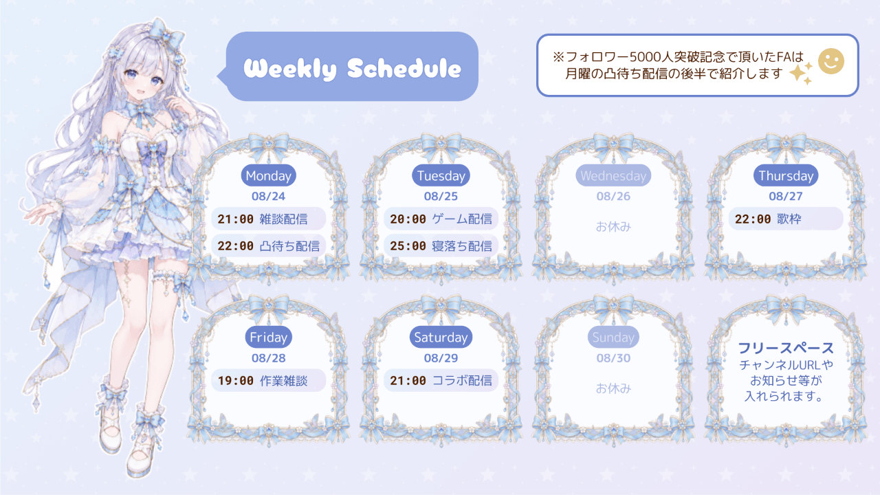
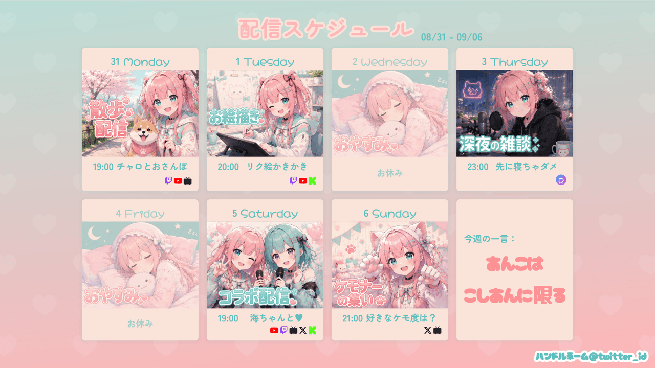
Custom presets: save your current settings under a name (kept in this browser’s localStorage). They appear in the same list under “Custom”.
Basic tab
Image-wide settings, plus the text styling for the title, period and handle.
Basic info
- Start date: the dates, weekdays and period of every row are derived from it. It moves to the week containing today each time you open the tool (the weekday you saved is kept)
- Size: the size of the exported image (= the canvas)
- Landscape 16:9 (1920×1080) — for X posts
- Landscape 16:9 (1200×675) — for X posts, lightweight
- Portrait 4:5 (1080×1350) — larger on mobile
- Square 1:1 (1080×1080) — general purpose
- Phone portrait 9:16 (1080×1920) — for stories
- Custom — width × height in px
- Overall scale (%): scales the whole schedule at once
Main style
The baseline text style for the image: font / color / bold, italic, underline / text decoration (neon glow, outline, blur shadow, retro shadow) / decoration color / decoration strength (px). Anything set per element overrides it.
Title, icon, period and handle
- Title: font / size (px) / color / letter spacing (px) / text style / decoration
- Icon: a Material Symbols glyph before and/or after the title. Pick “Custom” for any icon not in the list and type its name
- Period: the “6/22 - 6/28” line generated from the start date — font / color / text style / decoration / opacity
- Handle: your name plus an icon image — font / color / text style / decoration / opacity
Schedule tab
Where the actual plan for each weekday goes. A day can hold any number of slots.
Per weekday
- Live: untick it and the day becomes a day off (the wording can be set per day)
- Slot: start time / end time / content / platform.
+ Add slotadds as many as you need - Content: rich text — set the font, color, size (px), B, I, U and left / center / right alignment for the selected range
- Translation (2nd line, optional): a second line under the content, with its own font, color, size and decoration. Switch on Ruby (above label) to place it centered above the content instead
- Platforms: Twitch / YouTube / X / ニコ生 / Kick / REALITY / Custom. Pick several for a simulcast.
+ Add customregisters your own icon image and name - Has guest:
+ Add guestlines up an icon and a name — for collabs - Fill color / Border color: set per slot
- Thumbnail: the image used for that day in the card layout
Time
- Format: 24-hour (21:00) / 12-hour (9:00 PM)
- AM/PM style:
AM / PM/a.m. / p.m./午前 / 午後 - Time arrangement: side by side or stacked (start above end)
- Range separator / stacked separator: the character between start and end, and its size
Time zone
Pick the primary time zone from the list or filter it by typing a city or region (for example Tokyo, New_York, London); IANA names that are not in the list can be typed directly. Up to 2 additional time zones can be added.
| Style | Result |
|---|---|
| Inline | one line, like 21:00 JST / 12:00 UTC |
| Two lines | the primary time on top, the converted time smaller below |
| Footer note only | rows show the primary zone only, with a single note line at the bottom |
Picking Footer note only also reveals the settings for the note itself.
- Note text: left empty it reads “All times (primary zone)”
- Font / size (px) / Color
Each row is converted on its own real date, so daylight saving transitions (EST/EDT and friends) come out right. The footer note is an independent block, so it can be dragged or nudged separately from the table.
Layout tab
How the table or the cards are assembled, plus stacking order and positions.
Schedule table
- Layout: Table / Card (hide the schedule table and the layout can be built from free-placed elements alone)
- Card layout: columns / gap (px) / background panel (split = one panel per card, merged = one panel around the whole grid) / divider between cards / platform position (bottom / top / top right / top left) and alignment (left / center / right)
- Date and weekday: stacked or side by side, order (date → weekday / weekday → date), gap (px)
- Time and content: stacked or side by side, order (time → content / content → time), vertical alignment of the time (top / center / bottom), gap (px)
- Column widths: table width (px), and auto or fixed px for the date / time / platform columns
- Row gap (px)
- Column headers: the wording, color and boldness of the content and time headers
- Leading checkbox: color / size (px) / Auto-check up to today (rows up to today are ticked automatically). Shows how far through the week you are — for people who update and re-post the schedule every day
- Card shape: rectangle / rounded / top corners rounded / bottom corners rounded / circle / top half-circle / bottom half-circle / image (the picture itself becomes the card frame, with aspect-ratio lock, inset and antialiasing)
- Date band / thumbnail: the band across the top of a card (background color, padding) and the thumbnail height, fit and position
- Table border and background: border (solid / dashed / dotted / double) / background color / radius / padding / shadow
- Row divider: style, thickness and color — or pick Custom to repeat an icon or an image as the line
- Row bar: choose None, One bar per row or Split content / time, then set color, gradient, border, per-corner radius, padding and shadow. Same pattern as background lets the background pattern show through the bar
Layers
The five blocks (schedule table, title, period, footer note, icon + handle) and every free-placed element share one ordered list; whatever sits higher is drawn in front. Reorder with ▲▼ or by dragging the handle, and select two or more to group them so they move together. The button in the heading opens the same list in a wider dialog. The switch on each row toggles show / hide as well (it is the same switch as on the owning tab; hidden rows appear dimmed but you can still change their stacking order).
Element position
Set the X, Y and rotation of the title / period / icon + handle / table / footer note numerically. Overall position shifts the entire schedule at once and can be reset.
Style tab
Font, color, size and decoration per kind of text. Leave a field empty and it inherits the baseline (Main style in the Basic tab).
- Date: format (
8/30,08.30,8月30日,Aug 30,30th Augustand 19 more, plus a custom format) / font / color. Switching the date presentation to split month and day lets you style the month number, the day number and the separator independently - Separator: slash (/) / dot (.) / hyphen (-) / middle dot (・) / long diagonal line / icon / none
- Weekday: font (with a “same as date” button) / label format (
日 月 火 …,Sun Mon Tue …,Sunday Monday …and more, plus custom) / color (one color, per weekday, or a gradient) / weekday background (a circle, rounded or square badge filled with a color or an icon) - Time text: font / color / weight / italic and underline / decoration
- Content: alignment / font / color / text style / decoration / opacity
- Day-off text: the day-off wording / alignment / Align to content column / vertical position (px) / opacity (%). The text shown on days that are not live, and its style
- Platform badge: font / color / text style / decoration / opacity / badge background (shape, radius, color, padding) / custom label size (px)
- Guest: the name’s text style and the icon size
In a custom date format, wrap characters that clash with the placeholders (M / D / Y …) in [...] to print them literally — M/D [3D LIVE] becomes 6/22 3D LIVE, whereas leaving it unwrapped turns 3D into 322.
Free placement tab
Add an element with + Text, + Image, + Icon or + Shape, then set X / Y (px), rotation (°), horizontal / vertical flip and opacity numerically. You can also drag it on the preview. The show / hide switch in each element’s heading hides it temporarily without deleting it. Whether an element sits in front of or behind the table is decided by the order in Layers.
- Text: size / B / I / U / alignment / width (px) / decoration (neon glow, outline, blur shadow, retro shadow) / background color and radius. Date placeholders are filled in from the start date
- Image: width (%) and opacity. Clipping frames it as a circle / square / rounded / star / heart / diamond / hexagon / triangle / custom icon. Switch to “Multiple” to make several clips from the same image and place them separately
- Icon: a Material Symbols glyph placed as an element (size, color)
- Shape: circle / ellipse / rectangle / rounded / speech bubble / triangle / diamond / star / hexagon, with width, height, radius, border (solid / dashed / dotted / double) and opacity. A speech bubble’s tail has a side (bottom / top / left / right), a position (%) and a size (px), and tilts to follow the rounded corner
Filling in dates and contents
Type {1:day} in a free-placed text and the schedule fills it in. This is how dates and contents are placed when you build without the table.
| Written as | Filled with |
|---|---|
{1:day} | the date of day 1 |
{1:week} | the weekday of day 1 |
{1:label} | the content of day 1 |
{1:time} | the time of day 1 |
{1:M/D} | the date of day 1 (format given directly) |
The number counts days from the start date, 1–42. Contents and times only go up to 7, the days you can type in (beyond that the text is left as written). For a day with several slots, add the slot number: {1.2:label}. A format written here overrides the Date and Weekday settings.
Background tab
Base
- Shape: rectangle / rounded / circle / bottom corners rounded / top corners rounded / bottom half-circle / top half-circle (plus the radius in px)
- Type: fill / image
- Fill: solid / linear gradient / radial gradient (two colors and an angle)
- Image: load a file, then choose how it sits (cover / contain / tile / stretch) and its opacity
Pattern
A motif laid over the base. 37 patterns are available.
Stripes / Dots / Grid / Hexagon / Zigzag / Plus / Circuit / Pixels / Scales / Gingham / Argyle / Herringbone / Cross-stitch / Stars / Hearts / Flower field / Twinkle / Ribbons / Cherries / Cats / Paw prints / Waves / Confetti / Sunburst / Botanical / Snowflake / Bubble / Checkerboard / Seigaiha / Uroko / Asanoha / Shippo / Kagome / Tatewaku / Yagasuri / Sankuzushi / Sakura
Besides pattern size (px), angle and color, multi-color fills let you paint the faces of a motif separately. Opacity applies to both the motif and the fill colors.
Border: a border around the whole image (solid / dashed / dotted / double / groove / ridge) and its color.
Preset tab
The preset list, plus saving and deleting your own. The list is grouped into Table / Card / Other / Custom.
- Clicking a preset overwrites the current settings (
Ctrl+Zundoes it) - Keep schedule content (text / time / date): tick it to swap only the look and keep the schedule you already typed
- The + button saves the current settings as a custom preset (in this browser’s localStorage)
Export tab
Export image
- Share: renders the image and opens the share modal (X / Threads / LINE / Bluesky / Facebook / Telegram / WhatsApp / Hatena / mail / copy image or text)
- Save PNG only: save it as a file
- Include overflow area: exports images and decorations that extend beyond the canvas without clipping. The output grows by the overflow (the canvas itself stays at the chosen size)
Share / migrate settings
- Copy JSON / Paste & apply JSON: move settings around as text
- Export JSON file / Import JSON file: for settings that include images, where the JSON gets long
Edit mode
A row of buttons sits under the preview: zoom / Fit (reset the zoom to fit the whole canvas) / Edit / Select all / Show/hide UI (F — hides the editor UI for the same look as after export; Esc also restores it).
Edit (shortcut: E) lets you move elements directly on the preview. Clicking an element jumps to its settings.
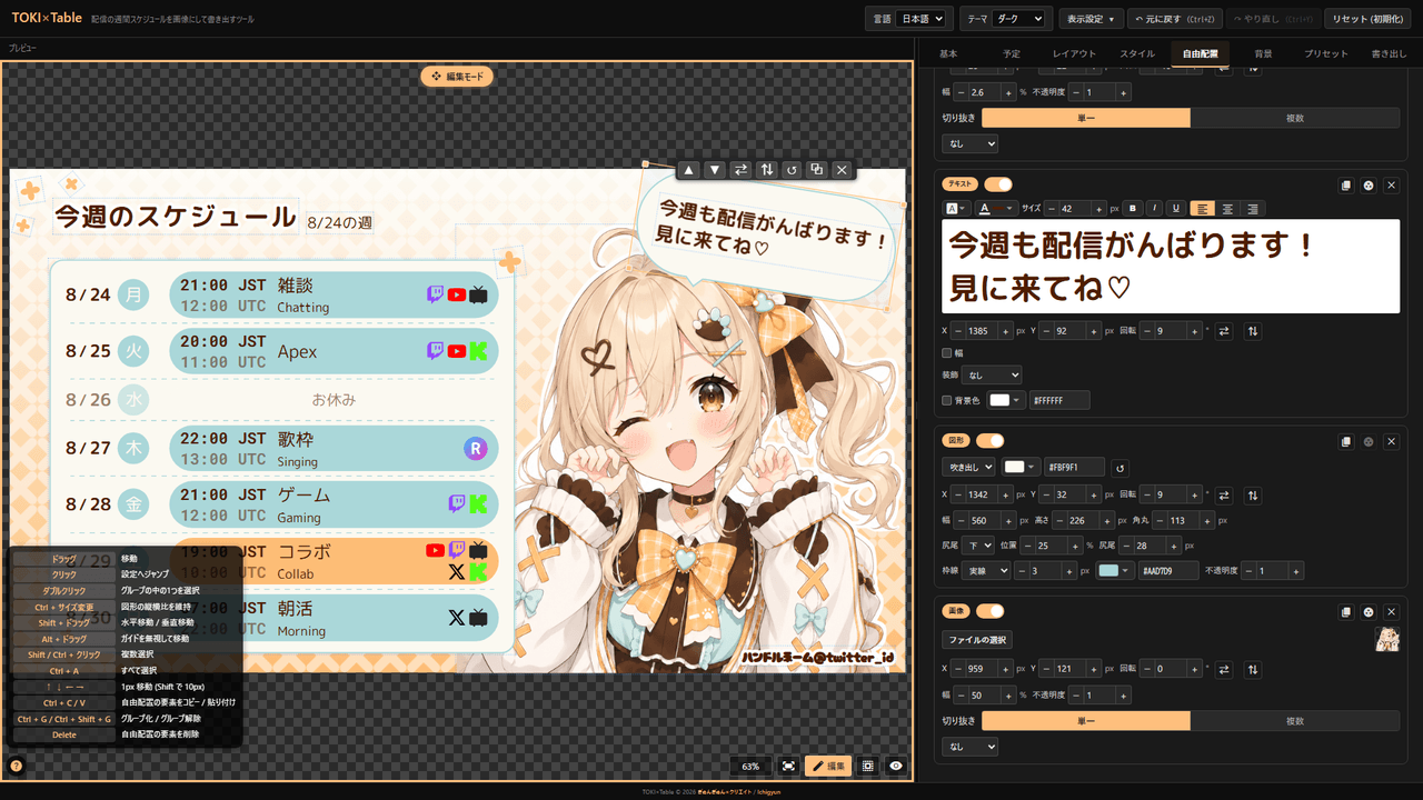
| Control | Action |
|---|---|
| Drag | Move |
| Click | Jump to its settings |
| Double-click | Select one element inside a group |
Ctrl + resize | Keep a shape’s aspect ratio |
Shift + drag | Move horizontally / vertically |
Alt + drag | Move ignoring the guides |
Shift / Ctrl + click | Select multiple |
Ctrl + A | Select all |
↑ ↓ ← → | Move by 1px (10px with Shift) |
Ctrl + C / V | Copy / paste the free-placement element |
Ctrl + G / Ctrl + Shift + G | Group / ungroup |
Delete | Delete the free-placement element |
A clipped image also gets a handle in its centre — drag to reposition the crop.
Fonts
100+ fonts are bundled, sorted into 10 categories.
| Category | Fonts |
|---|---|
| 日本語 (19) | M PLUS Rounded 1cNoto Sans JPKosugi MaruSawarabi MinchoShippori MinchoKlee OneZen Maru GothicZen Kaku Gothic NewMochiy Pop OneHachi Maru PopYusei MagicStickDela Gothic OneRampart OneTrain OneKaisei DecolYuji SyukuHina MinchoBIZ UDGothic |
| 等幅 (時刻表示向け) (15) | Roboto MonoJetBrains MonoFira CodeIBM Plex MonoSpace MonoVT323Source Code ProInconsolataUbuntu MonoPT MonoAnonymous ProDM MonoCutive MonoGeist MonoMartian Mono |
| Sans (11) | RobotoInterPoppinsNunitoQuicksandMontserratBebas NeueAntonLatoOutfitDM Sans |
| Display (装飾) (19) | Cherry Bomb OneDotGothic16RocknRoll OneReggae OneOrbitronPress Start 2PBungeeBungee ShadeAudiowideMonotonRighteousRusso OneBlack Ops OneLobsterPacificoSilkscreenFaster OneMajor Mono DisplayShare Tech Mono |
| Script (筆記体) (7) | CaveatDancing ScriptIndie FlowerPermanent MarkerShadows Into LightGreat VibesSacramento |
| 韓国語 (7) | Noto Sans KRNanum GothicNanum MyeongjoGaeguCute FontSingle DayJua |
| 中国語 (8) | Noto Sans SCNoto Serif SCNoto Sans TCNoto Serif TCZCOOL QingKe HuangYouZCOOL KuaiLeZCOOL XiaoWeiLiu Jian Mao Cao |
| タイ語 (4) | Noto Sans ThaiSarabunKanitMitr |
| ロシア語 (7) | PT SansPT SerifPhilosopherYeseva OneMarmeladBad ScriptMarck Script |
| System (4) | system-uisans-serifserifmonospace |
Language / view settings
Everything below is switched from the header and persisted in localStorage:
- Language: 日本語 / English — UI labels, hints and the weekday / date wording
- Theme: Dark / Light / Fancy / Handcraft — the editor UI only (the schedule image is unaffected)
- View settings: under “Editor view”, UI scale (90% / 100% / 110% / 125% / 150%) / menu side (right / left) / background (checker / dark / light / transparent / solid)
Data storage
- Autosaved to localStorage: every change is stored, so closing the tab and coming back restores your work (if saving fails you are told)
- The start date follows the current week: only the dates move; the weekday and the contents of each day stay. If a free-placed text uses a high-numbered date placeholder, you are asked before it updates
- Undo / Redo:
Ctrl+Z/Ctrl+Y - Reset: “Reset (initialize)” in the header restores the defaults
- JSON: copy / paste & apply / export as a file / import a file
Mobile
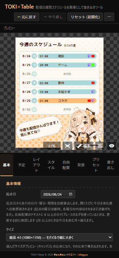
On phones the UI stacks automatically: the preview on top, the menu below. The screen is narrow and keyboard shortcuts are not available, so a PC is recommended for fine adjustments.
Credit
Crediting the tool in your streams or personal projects is not required, but it is always encouraging.
Standard format
TOKI×Table by Ichigyun
https://gyungyun.com/en/works/toki-table
Short format
Schedule: TOKI×Table (gyungyun.com) / @zkmy_kuro
For the terms covering bundled images and works created with the tools, see Terms of use on the top page.
Contact
Bug reports & Feature requests
Report bugs and request features for TOKI×Table here. Including your environment and steps to reproduce helps a lot.
Contact form ▶
Business & Other inquiries
For work requests and other inquiries, please email me.
Email ▶
Feedback & Cheers
Send me an anonymous one-liner. Even just "I'm using it" makes me happy.
Marshmallow ▶